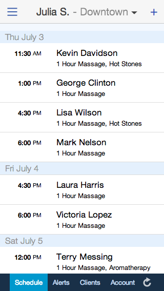
 Managing your schedule from your cell phone just got better – and a whole lot prettier! If you haven’t seen the new look of the mobile version of Full Slate, check it out now at m.fullslate.com on your iPhone or Android!
You’ll find a cleaner, more streamlined schedule tab that makes it easy to check your schedule on the go and quickly book appointments.
If you like a more compact “Agenda” view, you can hide the extra rows highlighting gaps between appointments. Just click the menu icon (looks like three horizontal lines) at the top-left corner of the Schedule tab to hide or show available windows. You can still add a new appointment by clicking the “Plus” sign in the upper right.
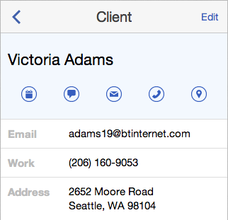
 It’s also easier to get in touch using new text, email and phone icons on each client’s profile. If you run a mobile business, you can even pull up a map of your client’s address with one touch of the map icon.
You can view other custom fields too. If you ask special questions on your booking form, you’ll find the client’s answers in the appointment details. Just tap an appointment to see all the information filled out.
And that’s not all – there’s lots more enhancements to the mobile site coming this summer.