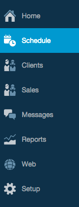
Watch for a new and improved Full Slate next week! 
Based on the positive feedback we received after updating the mobile site, we’re refreshing the web-based scheduling application with a new look and feel.
You’ll find bigger controls that are easier to use, especially if you access Full Slate with an iPad or Android tablet. We think you’ll find the larger buttons and cleaner drop-down menus to be intuitive and easy to navigate.
If you happen to be a QuickBooks Online user, you’ll find the look and feel to be very familiar.
There are no changes to the mobile version of the software.
So keep an eye out for the new look, coming in just a few days.
Update on November 21, 2014:
Because the development team is all-hands-on-deck working on the Google Calendar sync issue, we put on hold the release of the new look for several weeks. It’s generally ready to go, but we want to ensure a super smooth transition, so we’re waiting until the entire team can focus on it.
As we have updates on timing, we’ll provide them here.
Update on December 4, 2014:
The Full Slate makeover was released today…check it out!